← post tutorial with Femke notes
Skeuomorphism

This portion of text originally fed the second chapter of my thesis, but for word count reasons, it had to be cut. The positive side of this cut is that as a stand alone text, it can be sharper.
I don't believe solutionism in software has been active very long. Such perspective first needs consumers and a market, so the democratisation of the home computer likely accelerated the move to it. Meanwhile, a wider spreading internet access and multi device era really made way for the thinking of software as applications. Apps as solutions, apps in a market place, app stores. “There is an app for that.” In this environment, I find it interesting to observe how vendors have been responding to the enthusiasm with which consumers have adopted the devices that promise ease, while not necessarily being familiar with previous consumer computing environments. In the recent history of the iOS platform, a significant decision in development meant that iDevices no longer needed to be connected to a full function operating systems on initial boot-up, they were ready to work as stand alone devices ‘out of the box’ albeit after some account information and network connectivity settings. This development meant that at least some customers were depending on these new devices to be all that they expected a personal computer would be able to do for them. I believe this to be the point of a massive challenge to the vendor in the ease building into programs or apps, as it had to accommodate the spectrum of computer literate to absolute beginners. I wonder if the vendors had ever had to consider such a wide range of users. Nevertheless, in the end products, we have keys to understand how the user is considered by the vendor, through the visual communications of the interfaces. Skeuomorphism might be the most interpret-able subset of these visual devices. It is the term used to qualify the visual imitation practice that mimics typical or ornamental elements from physical counterparts onto the two dimensional screen. It imitates materials, textures and movement from the non computer world. I believe that skeuomorphism, even as a practice that is disappearing from the mainstream consumer computer, is telling of the considered position of the user, and her / his presumed ability to understand how software and applications are made.

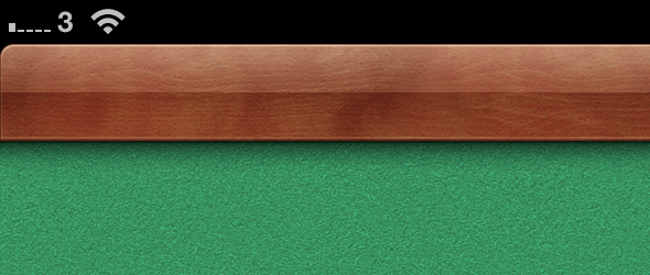
The attempt to make interface easier by grounding it with skeuomorphism is deeply confusing to me. I understand these imitations in interface as enormous problems in communication. If the interface is to indicate to the user how the application is to be used, then it is disenchanting to think about why the decorative skeuws were ever necessary. Imitating leather textures for a calendar application says to me that the software maker really could not trust me in understanding the words that the interface was displaying. I can not be trusted with my idea of what a virtual calendar is, it best have some leather around the edges so that I don't loose track of what it was intended for. Further, the use of a wood texture and a library shelf layout in a reader app can bring me to understand an other set of connected assumptions. For example the idea that I must keep all of my books, magazines and documents in the same place. That I have the luxury of displaying all of my books front covers, that for me to find my books amongst each other, they must have covers that are singular or legible enough to be identifiable, that readable mediums do not deserve sub classifications, or that books are finished objects, they meant to be read only, not manipulated, annotated, scribbled in, photocopied or torn apart.

All in all, the use of skeuomorphism iterates the power dynamic and hierarchic structure that exists in application type software, while constantly pushing the end user further down the process line. At my most bitter, I see this as an insults the user's cognitive ability, by assuming she/he is unable to conceive what an application may do. It sets boundaries for function by widening the gap in understanding that digital handling can be viewed as crafts of abstraction. It talks to the user assuming that the simplest scenario is the best for all, ignoring any desire for more complexity or more granularity in options and processes. I find skeuomorphism to be revealing because when taken apart, it shows that the user is understood by the vendor as someone that isn't capable of abstract thought.
https://youtube.com/v/gmn4ve4oTL8?start=499&end=515
previous section:
← post tutorial with Femke notes
next section:
→ Trim 5 assessment presentation