← International Design Movements
BSc in Digital Marketing with Analytics
Course schedule:
- Wednesdays from 11.00 → 13.00 (room A211)
- Thursdays from 11.00 → 12.00 (room A211)
Course introduction 2019_09_12
Brief subjects outline:
- Photography workflow: from camera to print
→ How to shoot RAW format photographs, import them into Camera Raw (a Photoshop tool), work on our photographs in Photoshop, then export them for other uses.
- Composition basics:
→ Making images, balancing the objects and elements in an image, choosing scale, choosing colours, choosing graphical or photographs, hand drawings, and adjusting them to one another on a page, poster, logo, flyer etc.
- Typography: selecting and using fonts
→ Typography is the art and technique of arranging type to make written language legible, readable, and appealing when displayed. The arrangement of type involves selecting typefaces, point sizes, line lengths, line-spacing (leading), and letter-spacing (tracking), and adjusting the space between pairs of letters (kerning).
- Vectors VS Bitmap: digital images
→ What is a vector image, what is a bitmap image, and how can we use them
- Page design — editorial design:
→ How to design good books, booklets, pages, flyers, leaflets, how to make imposed booklets (allowing one to fold printed pages into a booklet), how to prepare files for self-printing and professional printing.
2019/10/16
Film poster assignment
Visual communications gives us the power to convey an idea, or reference an item with very few symbols. This assignment aims to stimulate the message creation part of visual communication and the practical aspect of technically building the message using appropriate software.
Select three movies that you know well. A requirement for this assignment is that the three films you have picked are from different genres of cinema. For example, you could select one thriller, one documentary and one super hero film. Selecting three films from the same genre will make the assignment harder for you, so make sure each film are different and that you know them well.
From each film, identify key elements of the narrative, key scenes and key elements of dialog. Think about the tipping points or resolving elements of the films. Make a list of these and try to find how you could summarise the entire film using only a few symbols. These symbols might be important objects, significant props, elements of costumes, unique pieces of a characters physique, etc.
Also think of the color scheme used throughout the film. For example, a horror film is often very dark with very saturated accent colors. Other example: a sport film will have a lot of daytime colors like skies and bright jersey colors. Use these key colors in the poster you will design.
Use the following examples to guide how to think about your films and how you will translate these stories into a poster.
Your posters must include: the full titles of the films the name of the director of the film the visual construct you have chosen to sum up the film with a maximum of 5 different colors
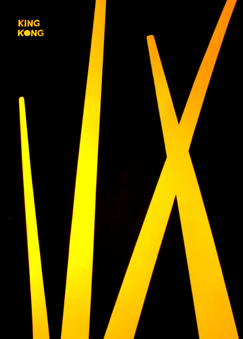
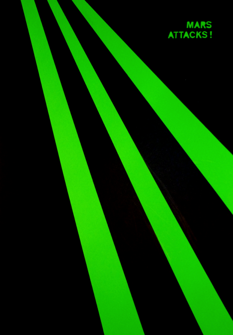
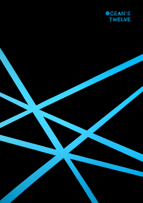
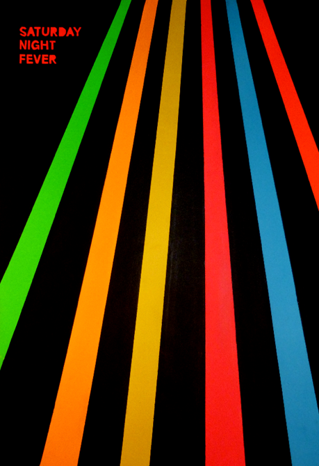
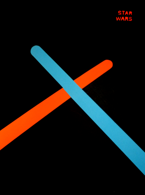
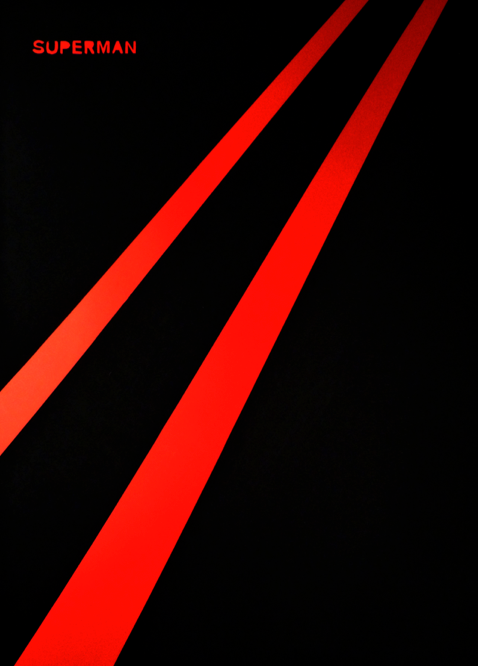
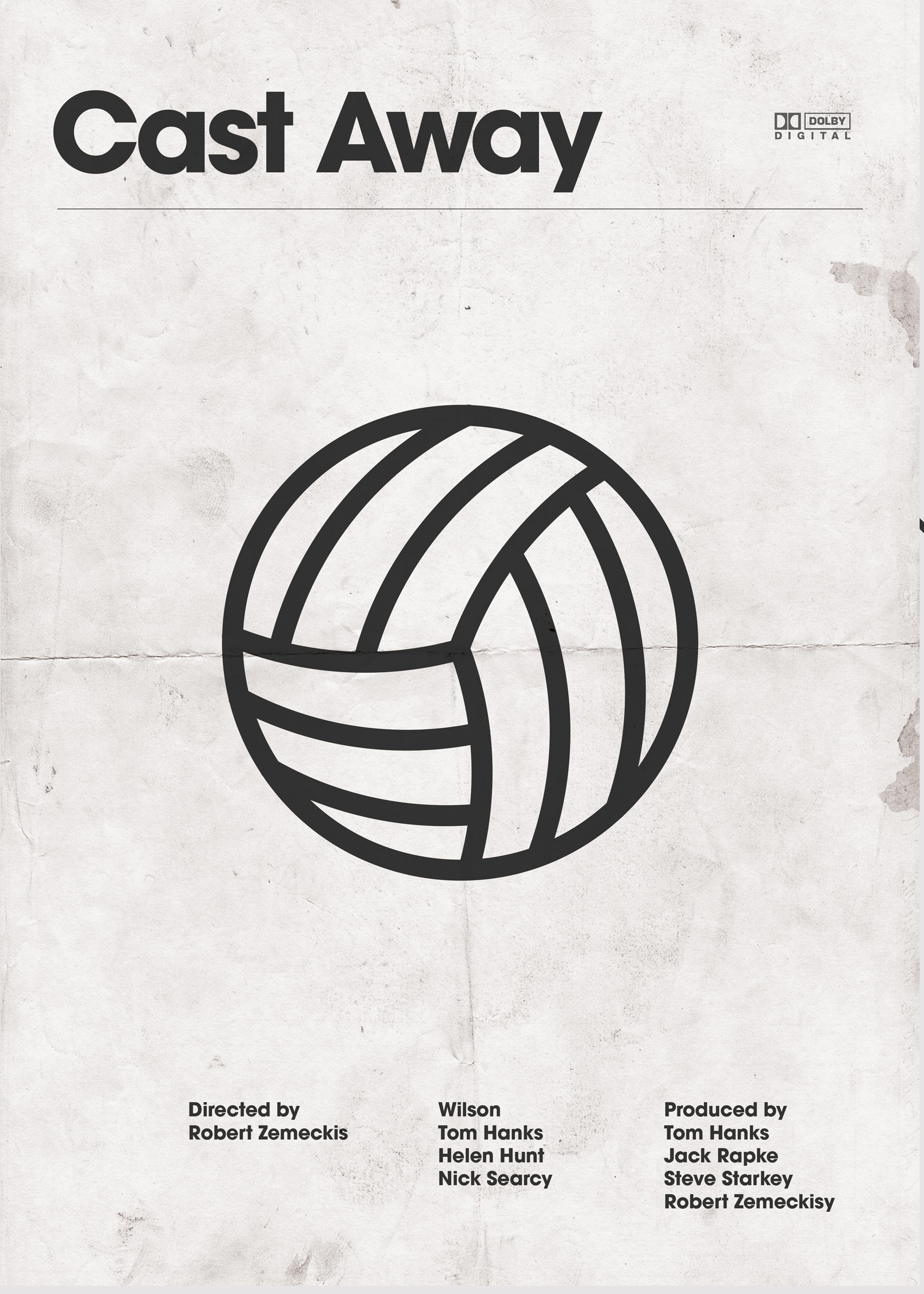
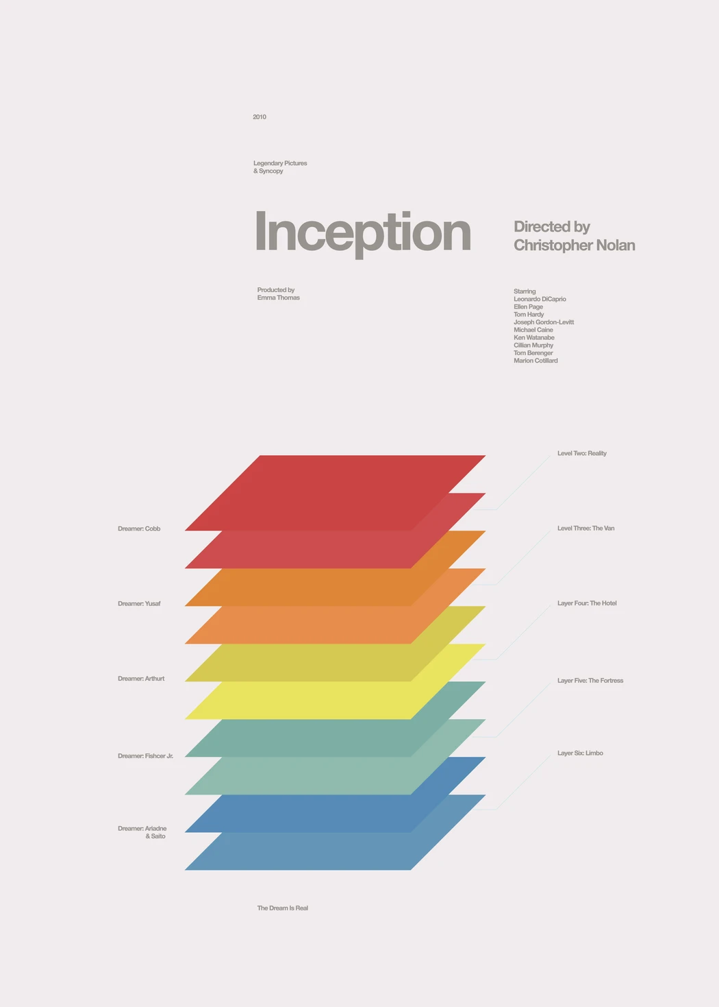
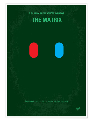
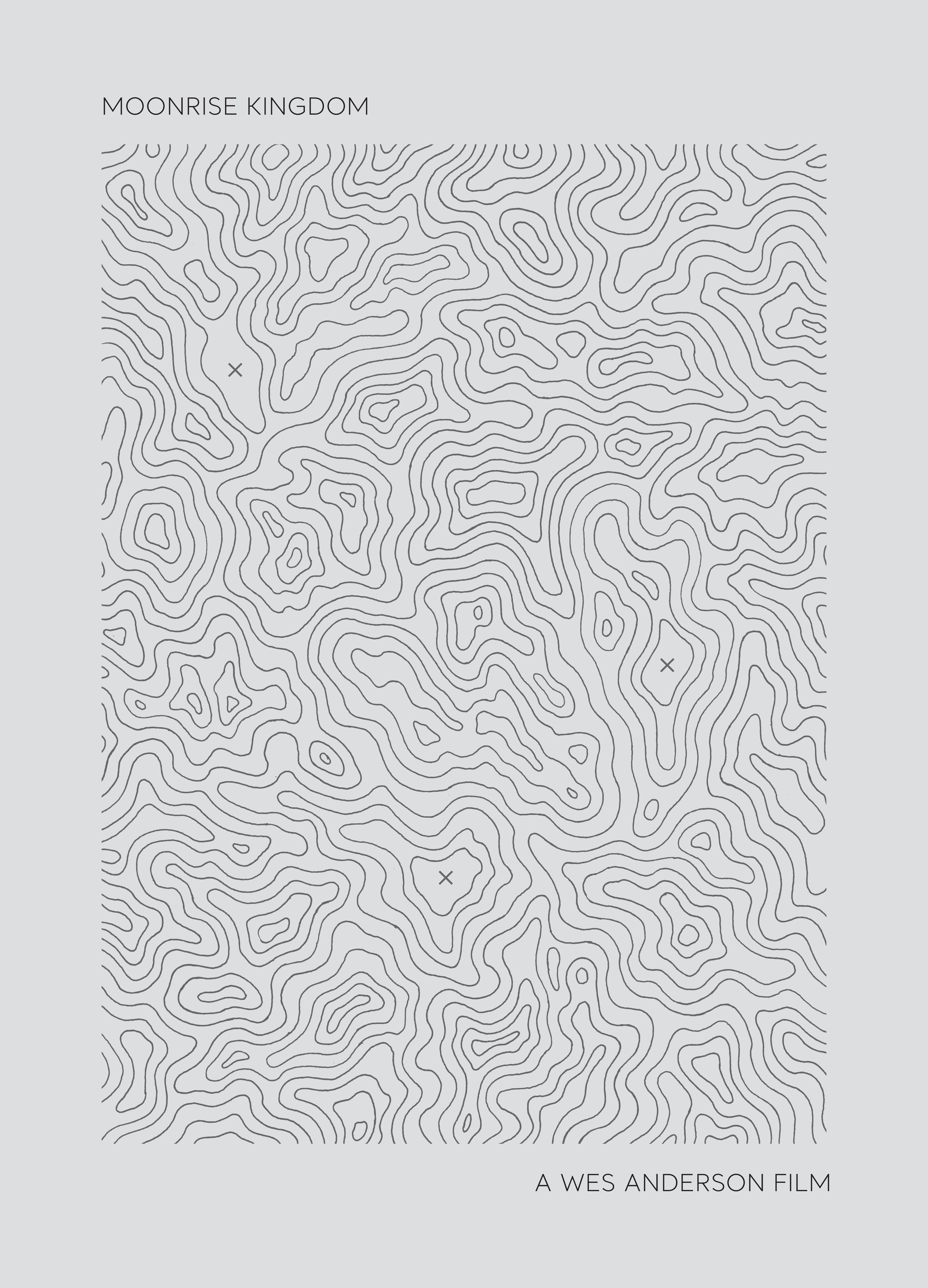
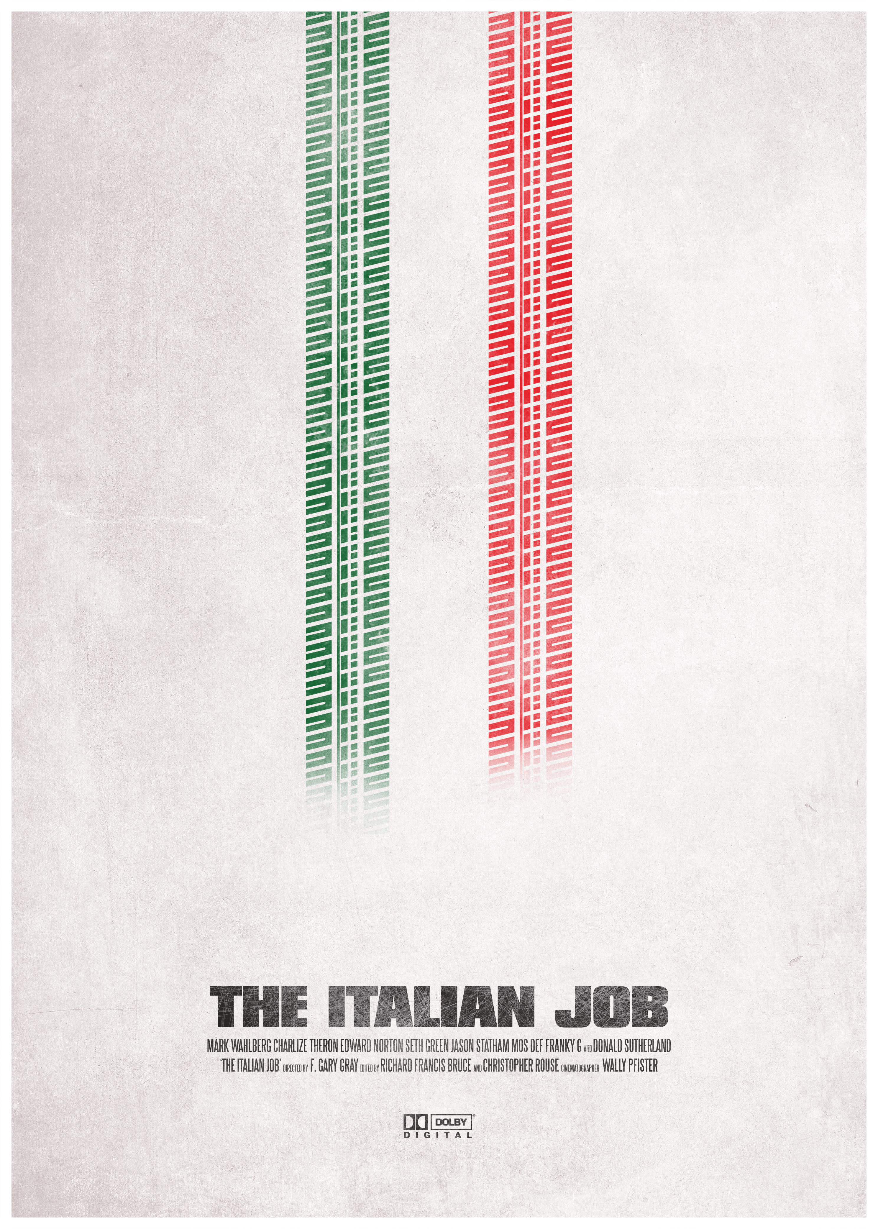

outline of a possible design process
- work on paper first
- write out ideas, list more than necessary, letting your brain work on more than the first ideas will give deeper thoughts and better ideas
- annotate your ideas, detail what it is your are talking about, identify key words, list key words and look for synonyms, sometimes other vocabulary helps us think about what we are designing
- draw early and draw often: making tiny post-stamp sized sketches, maquettes, outlines or wireframes of what your designs could look like will help you accomplish your ideas faster and more efficiently
- list out the technical difficulties and see if you can solve them or go around them
- lastly open your software tool of choice
illustrator resources
- pen tool exercise
- composition basics
- color theory basics
- pathfinder tool
2020/01/08 brief: portfolio research
Project rationale:
in preparation for the next major section of the module on personal portfolios, we must gain awareness of what and how different people/groups are using the portfolio medium to serve their communication needs. A portfolio is a curated selection of works that showcase the types of projects, types of work, aesthetics and ways of working of either an individual or a group.
Procedure:
In groups of 2 students, you must select two portfolios to analyse and present to the group. Of the two portfolios, you are required to find one web portfolio and one printable portfolio (typically, you will find these as PDFs on LinkedIn or other promotion websites).
The portfolios themselves can be showcasing works of individual artists, photographers, designers, architects, writers, copywriters, illustrators, performers, or type of practice that could benefit from having a portfolio to show work. You can also use portfolios from collectives or groups like design studios or architect bureaus if you desire.
Try to pick a portfolio of work that you enjoy, that have aesthetics that appeal to you. This will make the research more enjoyable for you and you will interesting diversity to the aesthetics and types of work that we will look at in the classroom.
Objective:
this project is designed to broaden our aesthetic horizons, to look at work in detail and understand how different types of work are shown in different ways. Photographers do not show their work in the same way architects do. Painters would approach portfolio making in a very different way to interior designers. The main objective of this research project is to observe many different types of portfolios to make informed choices about our next project; developing one's own portfolio.
Deliverable:
10 minute presentation to the class about both portfolios you have analysed with your partner.
Presentation Date:
Wednesday 22nd January 2020 — 11.00
The presentation might include answers to the following questions:
- who is the person that is showcased in this portfolio ?
- what is the format of the portfolio (print or web, if print, what is the page size ? Is this a book portfolio or a set of loose pages ? Is it bound ?)
- how long has the person been practising their craft ?
- how many projects are included in the portfolio ?
- are the projects shown over one single page or do the projects / artworks span multiple pages ?
- how would you describe the design of the portfolio ? (example answers: spacious, light in colour, very dense, dark, scattered, organised, legible, complicated, ...)
- what colours are used through the portfolio ? Is it on white pages or is there a background colour ?
- how would you describe the typographic work throughout the portfolio ? Is there much written information ? What kind of fonts are in use ?
- what is the language used in the portfolio ? (is this a first person text describing projects or a third person speaking about the projects ?)
- what type of imagery is used in the portfolio ? Photographs ? Graphics ? Illustrations ? Others ?
- how many pictures per page ?
- what is the cover of the portfolio ? what is the very first thing you see when you see the portfolio for the first time ?
Print portfolio examples:
- https://www.behance.net/gallery/439926/portfolio
- https://www.behance.net/gallery/9161207/Portfolio-Booklet
- https://www.behance.net/gallery/9965567/CV-Self-Promotion-Portfolio-MG
- https://www.behance.net/gallery/5611033/Personal-Portfolio
- https://www.behance.net/gallery/17328699/DESIGN-EDITORIAL-PORTFOLIO
- https://www.behance.net/gallery/77294809/Portfolio-Book-2019
- https://www.behance.net/gallery/81808821/Eves-documentation-A-personal-branding-Portfolio
- https://www.behance.net/gallery/81387483/My-Portfolio-2019
- https://www.behance.net/gallery/13497273/CV-Portfolio-Mailer
Web portfolio examples:
- http://www.vanacker.com/
- https://felicite.land/
- http://twistedfork.me/
- https://marianne-brandt-wettbewerb.de/en/home.html
- https://www.jakubcech.net/
- https://jmwl.studio/
- http://diegofunken.com/
In the pad below, write your group members + the portfolios you are working with.
2020/01/22
Principles of layout & composition
Some acknowledgements:
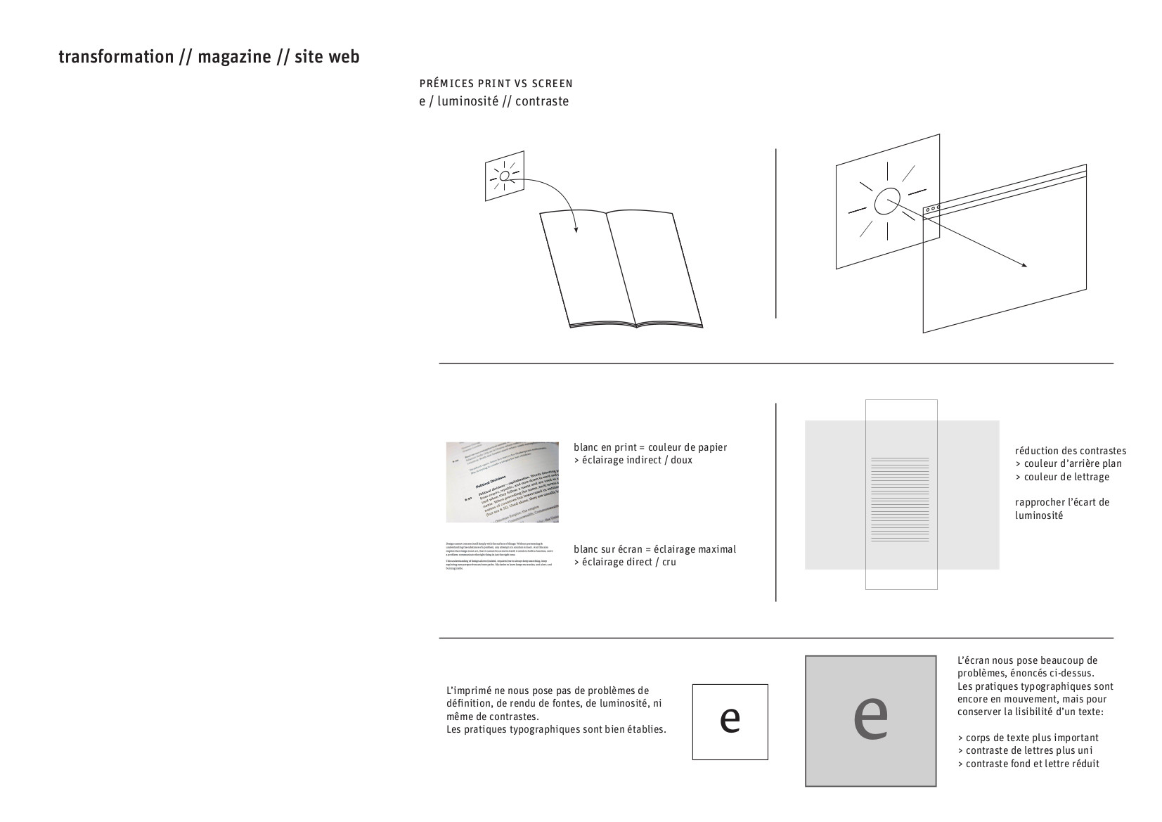
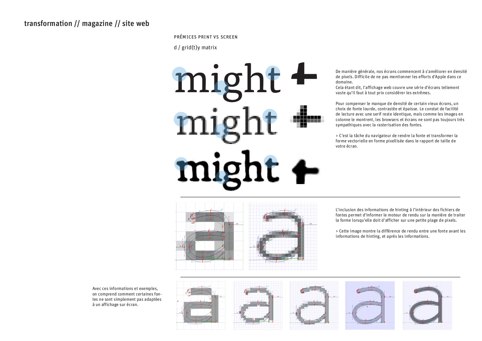
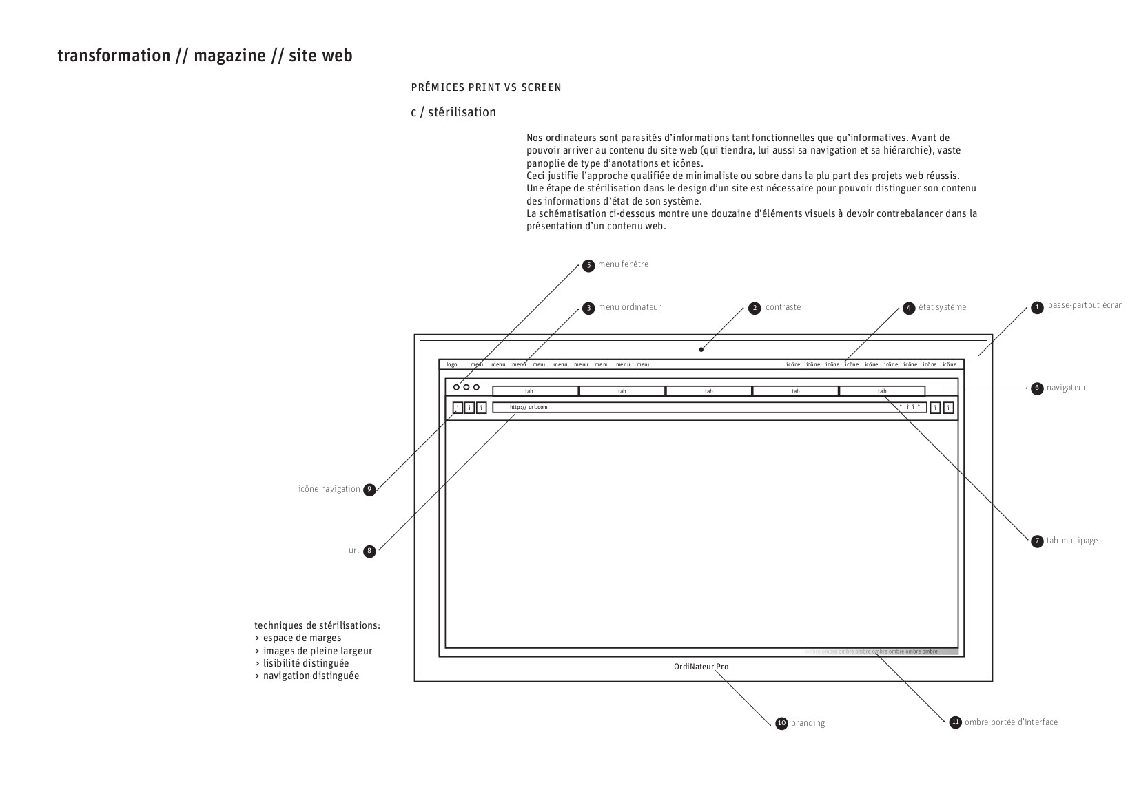
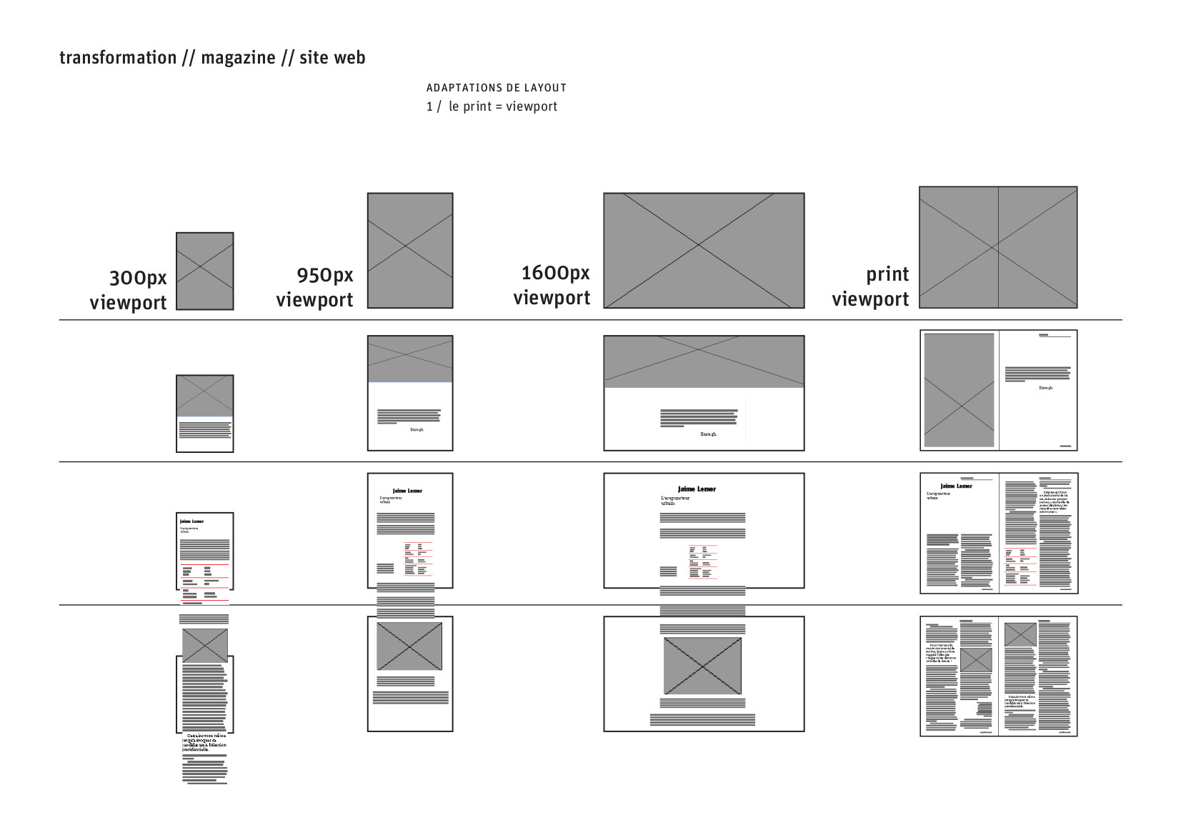
Further principals of layout:

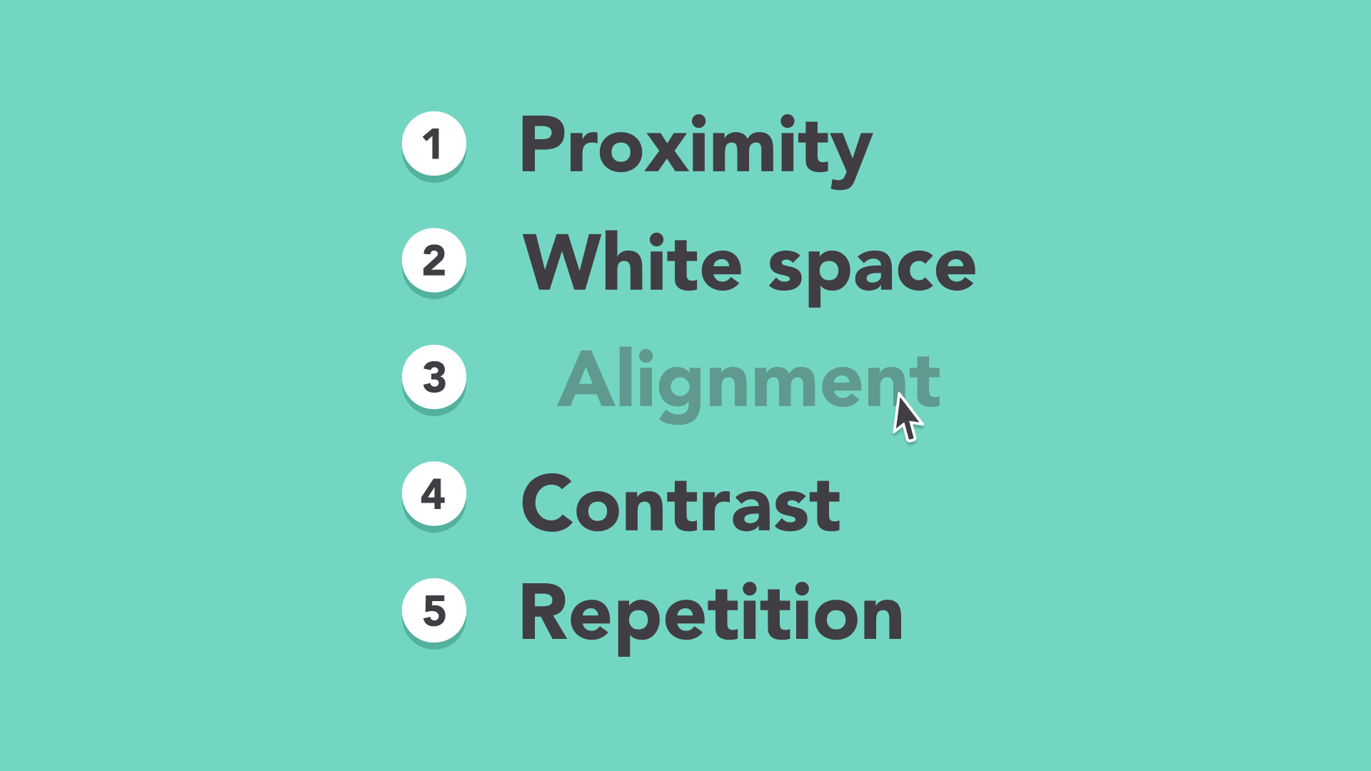
5 basic principals
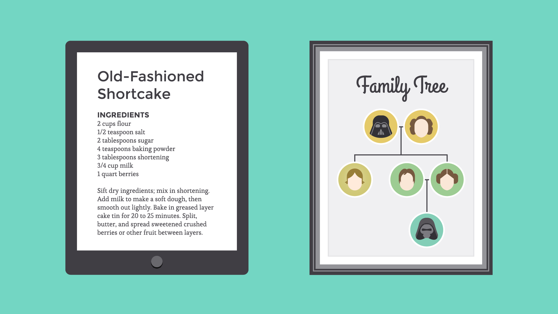
Proximity

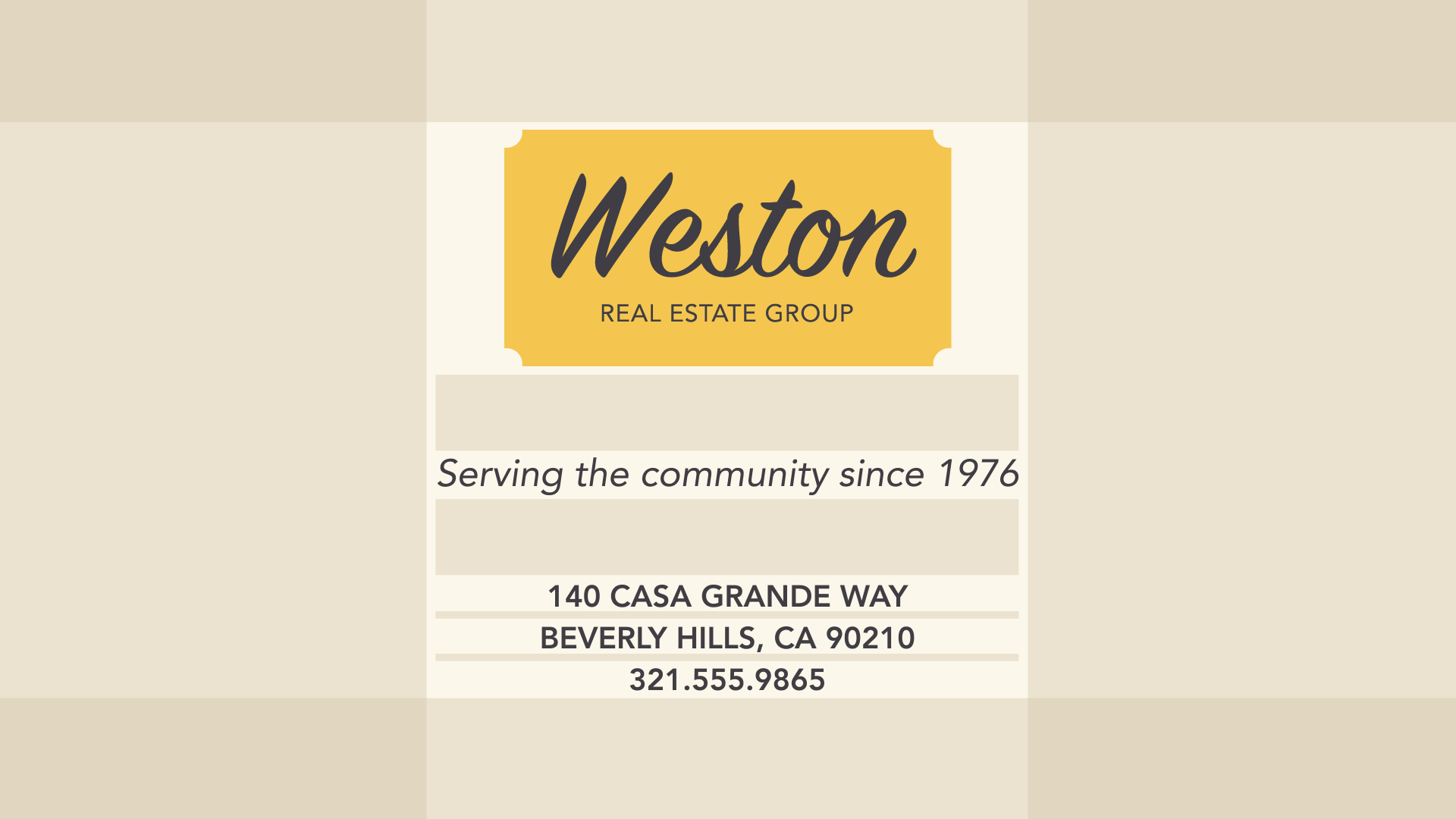
White space
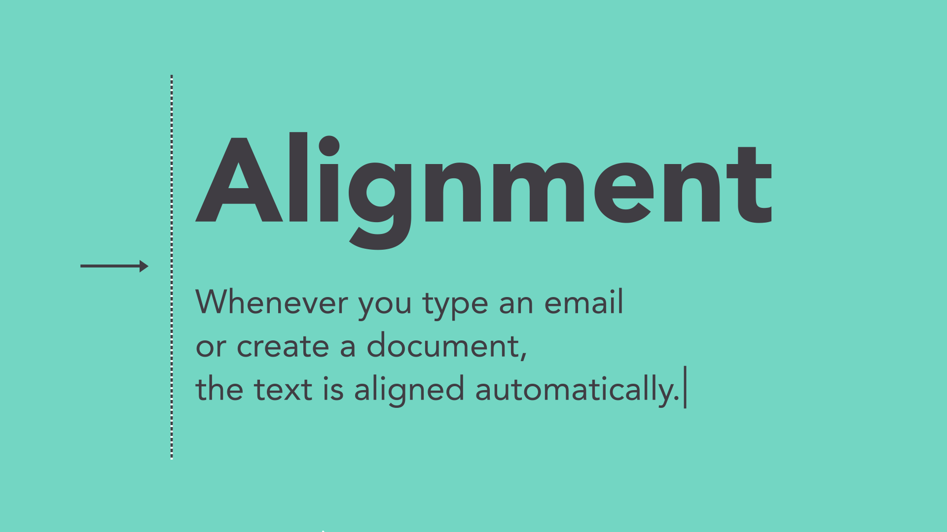
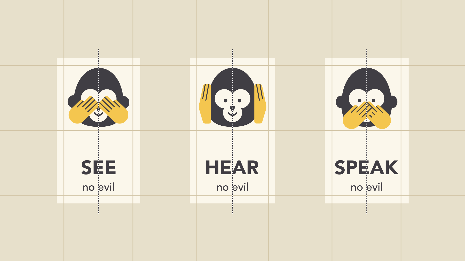
Alignment
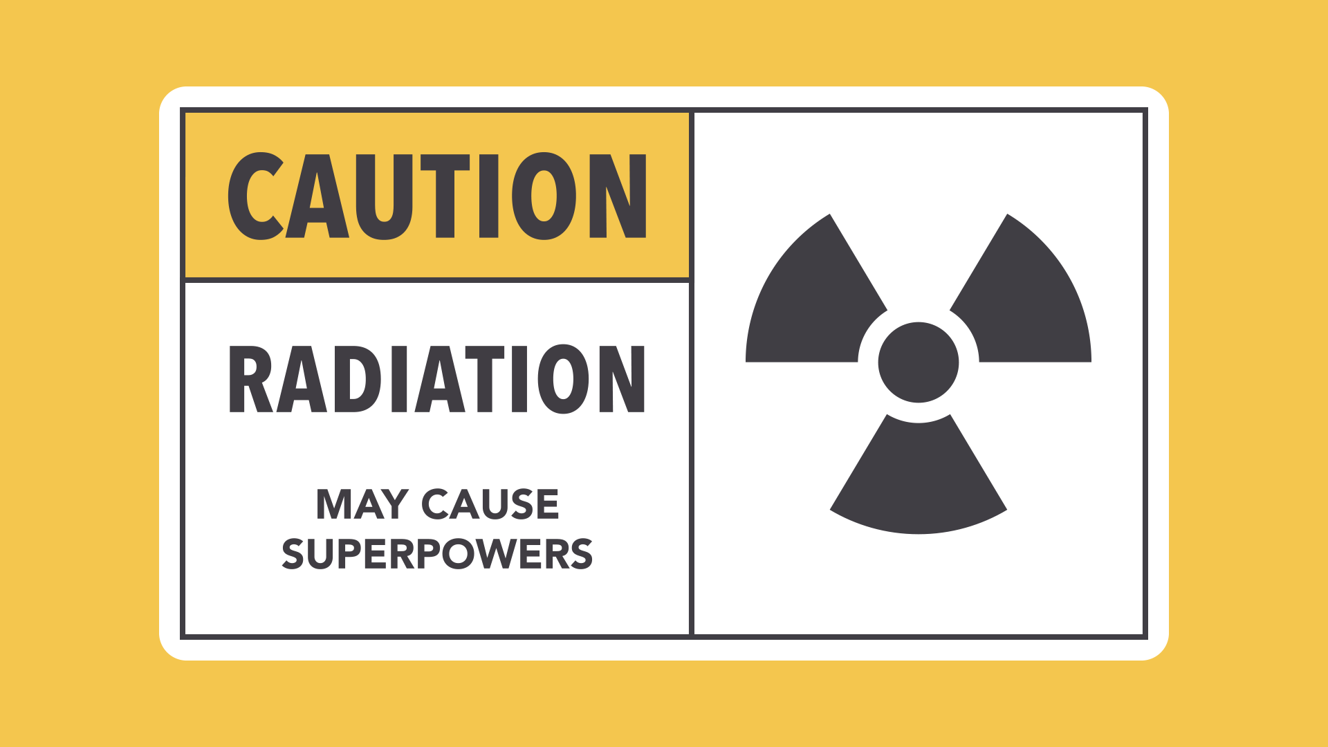
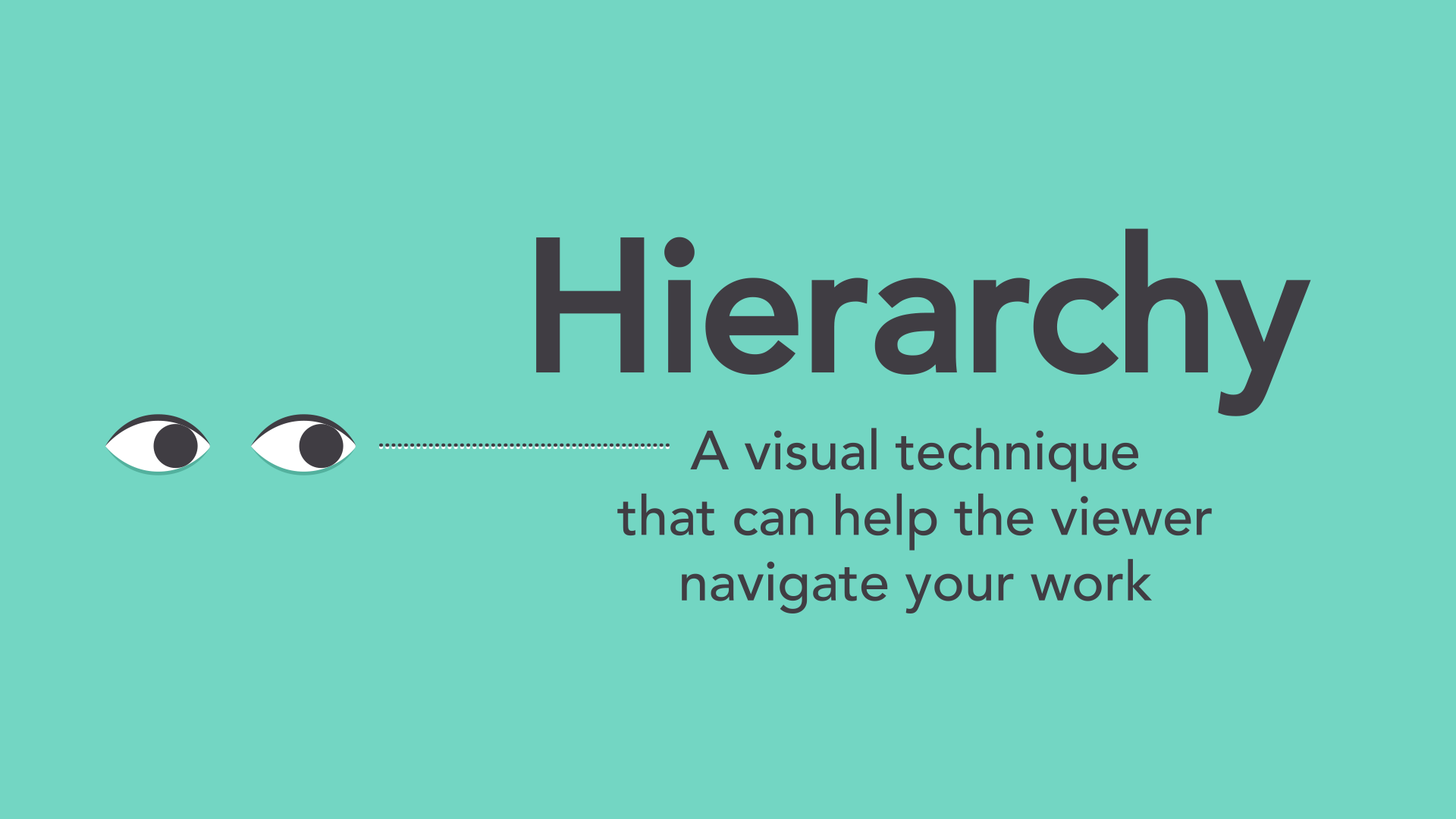
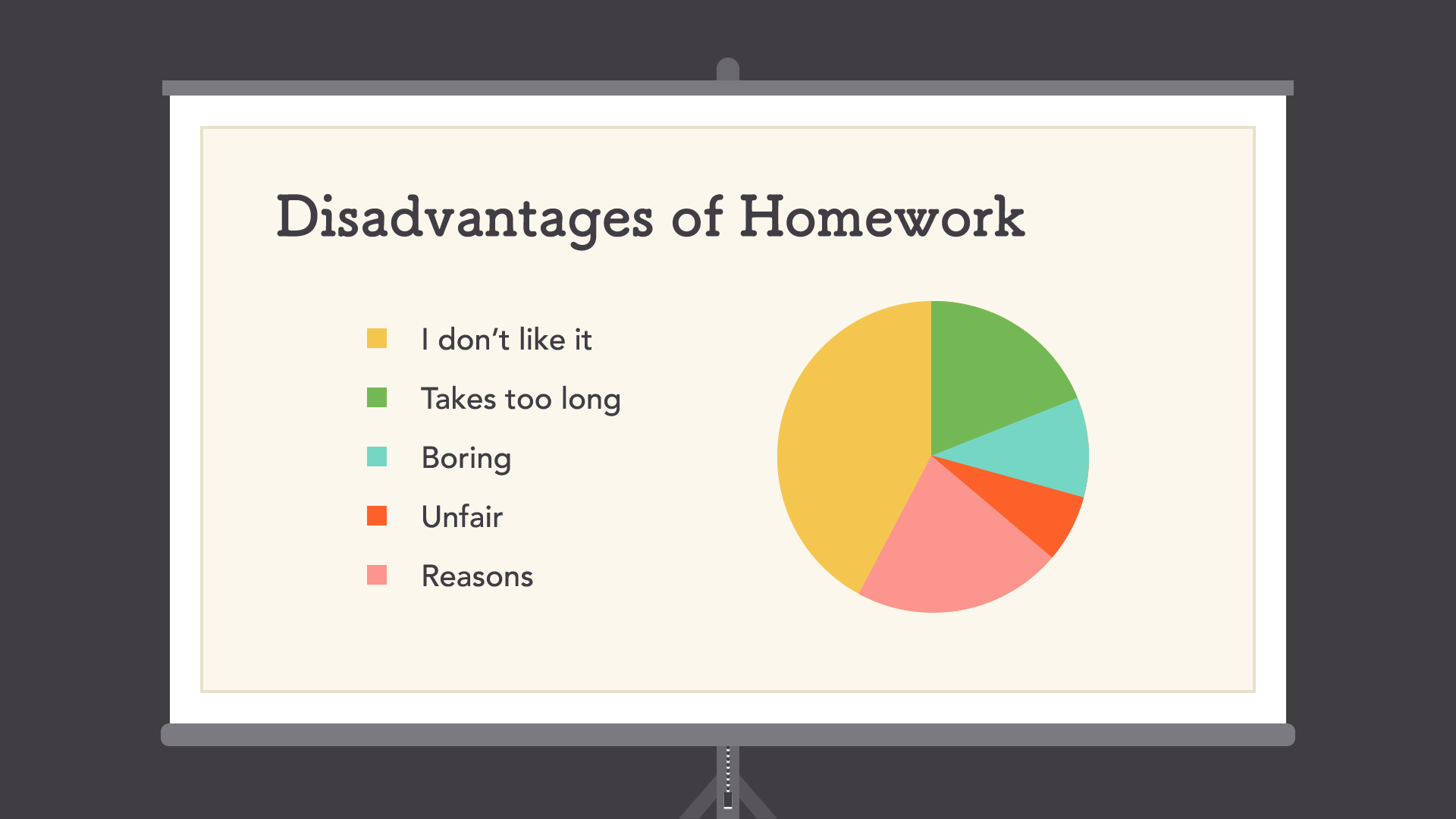
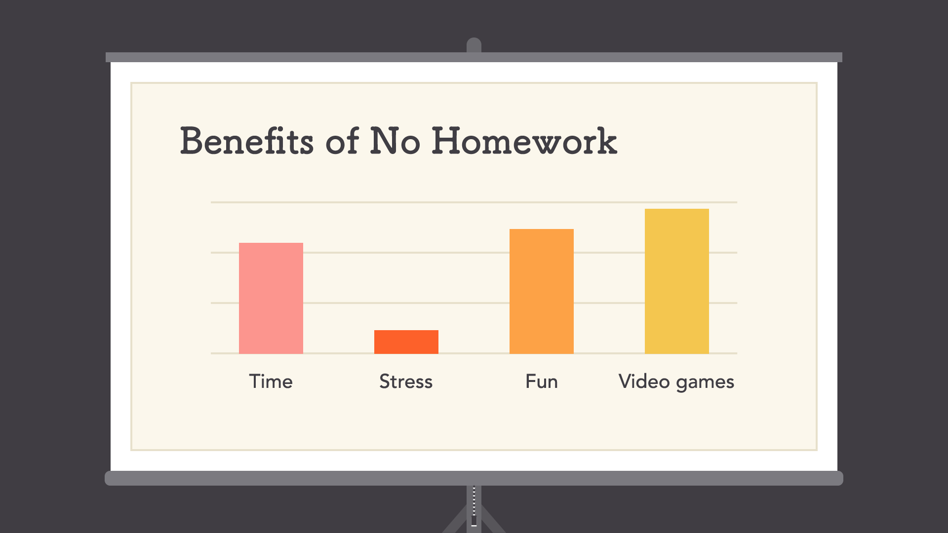
Contrast & Hierarchy

Repetition

Putting it all together
