BA Media and PR
Course schedule:
- Wednesdays from 10.00 → 11.00 (room A100) — Lecture
- Wednesdays from 14.00 → 16.00 (room A310) — Practical
Course introduction 2019_09_11
Brief subjects outline:
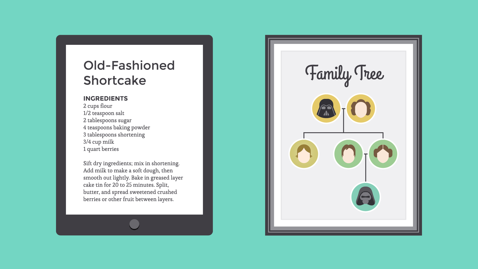
- Photography workflow: from camera to print
→ How to shoot RAW format photographs, import them into Camera Raw (a Photoshop tool), work on our photographs in Photoshop, then export them for other uses.
- Composition basics:
→ Making images, balancing the objects and elements in an image, choosing scale, choosing colours, choosing graphical or photographs, hand drawings, and adjusting them to one another on a page, poster, logo, flyer etc.
- Typography: selecting and using fonts
→ Typography is the art and technique of arranging type to make written language legible, readable, and appealing when displayed. The arrangement of type involves selecting typefaces, point sizes, line lengths, line-spacing (leading), and letter-spacing (tracking), and adjusting the space between pairs of letters (kerning).
- Vectors VS Bitmap: digital images
→ What is a vector image, what is a bitmap image, and how can we use them
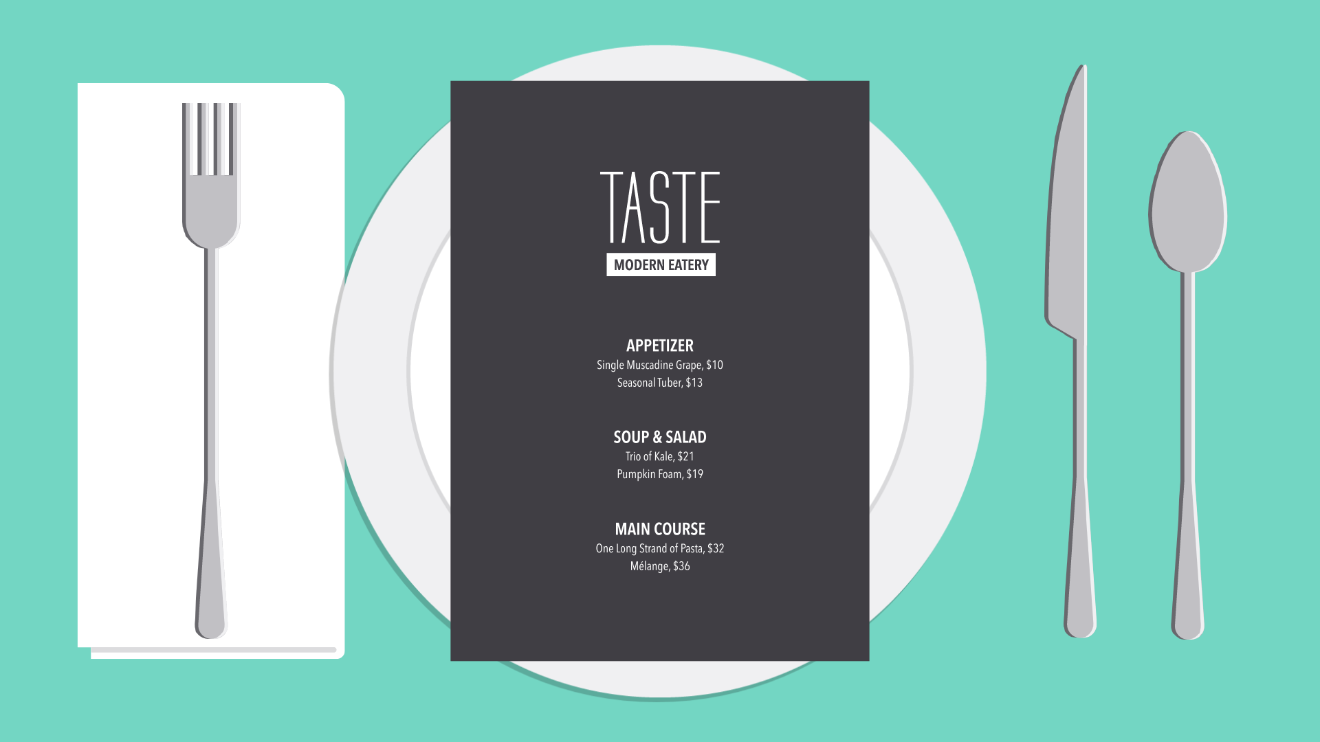
- Page design — editorial design:
→ How to design good books, booklets, pages, flyers, leaflets, how to make imposed booklets (allowing one to fold printed pages into a booklet), how to prepare files for self-printing and professional printing.
2019/10/16
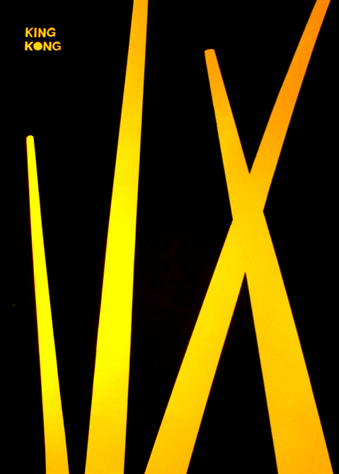
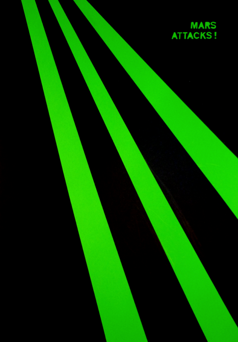
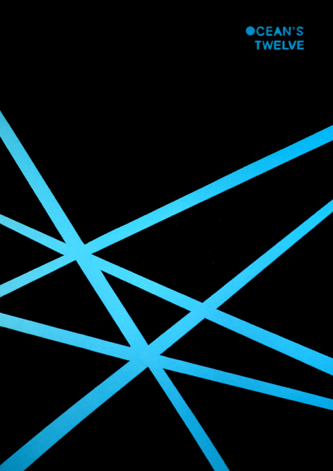
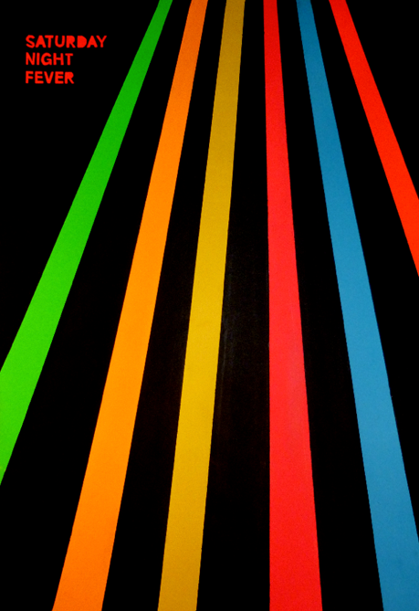
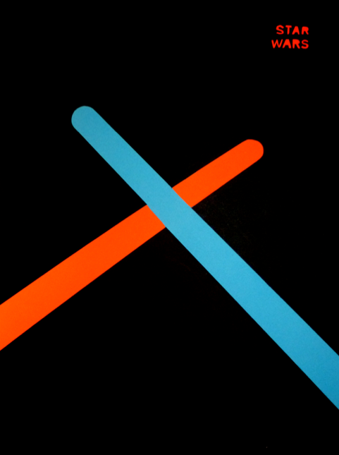
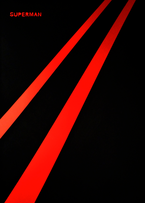
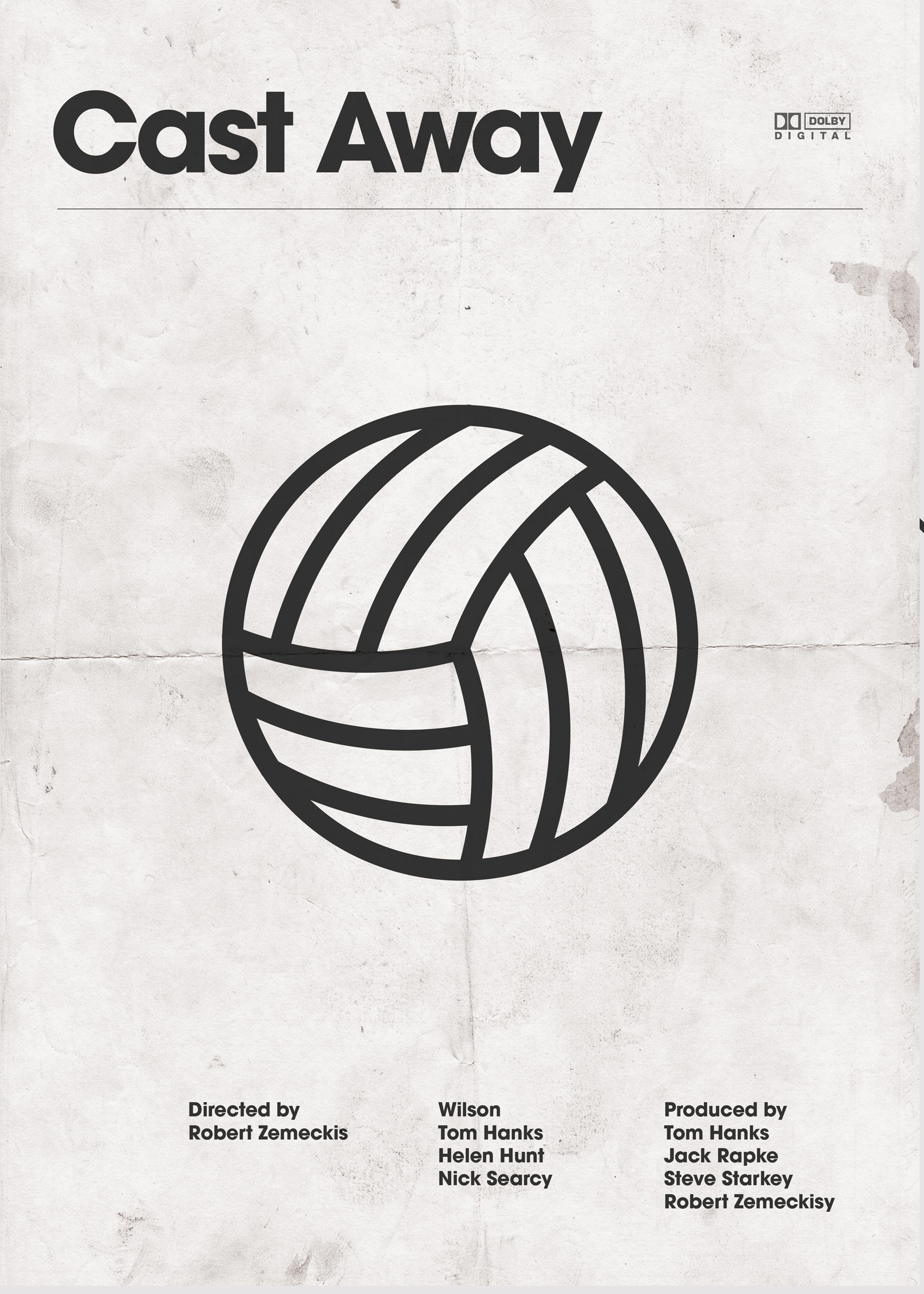
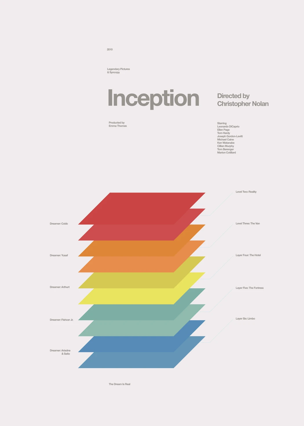
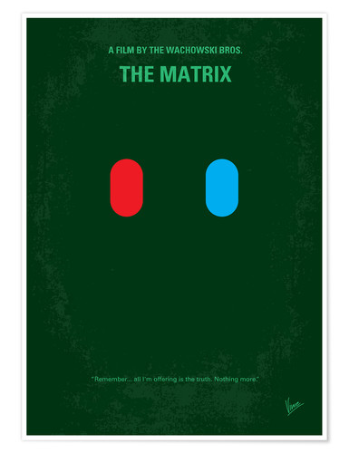
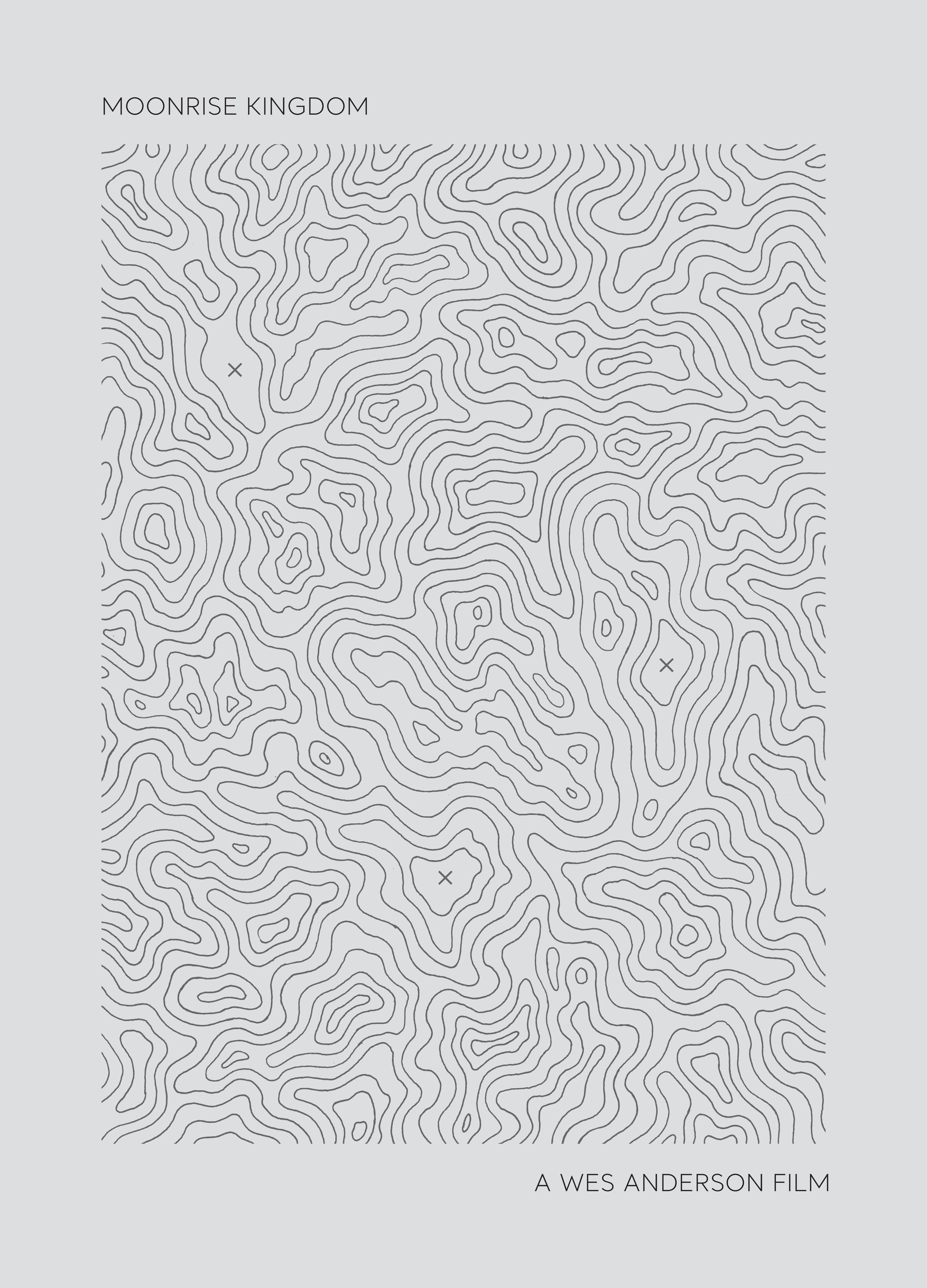
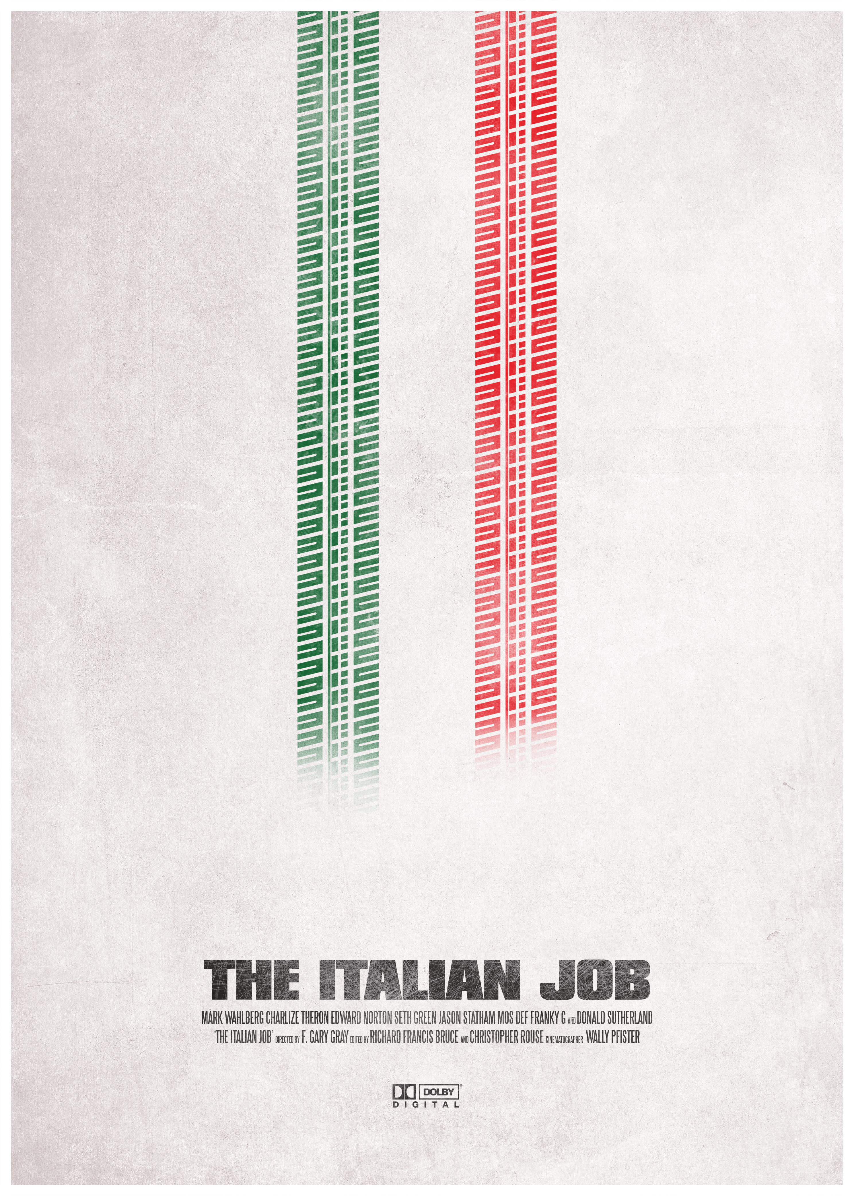
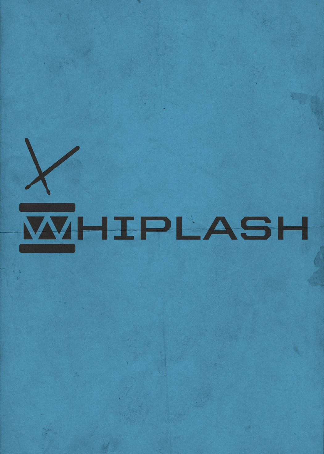
Film poster assignment
Visual communications gives us the power to convey an idea, or reference an item with very few symbols. This assignment aims to stimulate the message creation part of visual communication and the practical aspect of technically building the message using appropriate software.
Select three movies that you know well. A requirement for this assignment is that the three films you have picked are from different genres of cinema. For example, you could select one thriller, one documentary and one super hero film. Selecting three films from the same genre will make the assignment harder for you, so make sure each film are different and that you know them well.
From each film, identify key elements of the narrative, key scenes and key elements of dialog. Think about the tipping points or resolving elements of the films. Make a list of these and try to find how you could summarise the entire film using only a few symbols. These symbols might be important objects, significant props, elements of costumes, unique pieces of a characters physique, etc.
Also think of the color scheme used throughout the film. For example, a horror film is often very dark with very saturated accent colors. Other example: a sport film will have a lot of daytime colors like skies and bright jersey colors. Use these key colors in the poster you will design.
Use the following examples to guide how to think about your films and how you will translate these stories into a poster.
Your posters must include: the full titles of the films the name of the director of the film the visual construct you have chosen to sum up the film with a maximum of 5 different colors
outline of a possible design process
- work on paper first
- write out ideas, list more than necessary, letting your brain work on more than the first ideas will give deeper thoughts and better ideas
- annotate your ideas, detail what it is your are talking about, identify key words, list key words and look for synonyms, sometimes other vocabulary helps us think about what we are designing
- draw early and draw often: making tiny post-stamp sized sketches, maquettes, outlines or wireframes of what your designs could look like will help you accomplish your ideas faster and more efficiently
- list out the technical difficulties and see if you can solve them or go around them
- lastly open your software tool of choice
illustrator resources
- pen tool exercise
- composition basics
- color theory basics
- pathfinder tool
2020/01/08 brief: magazine research project
Project rationale:
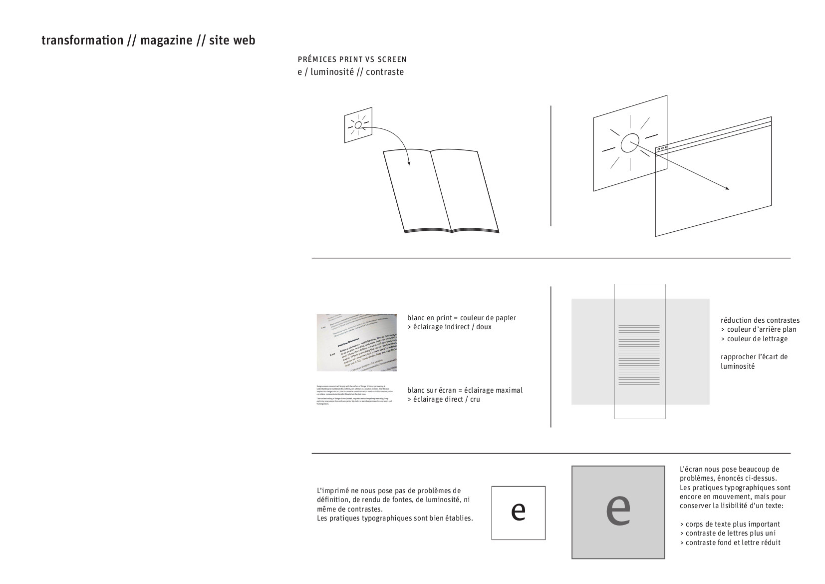
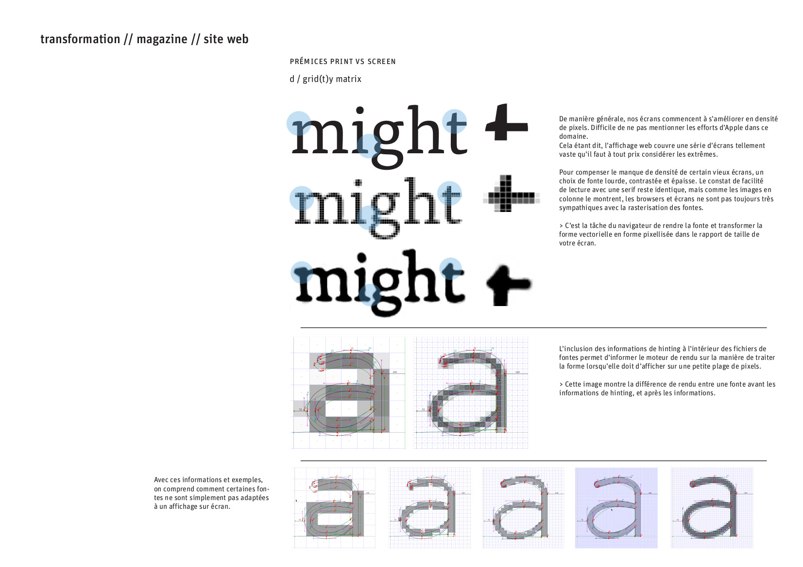
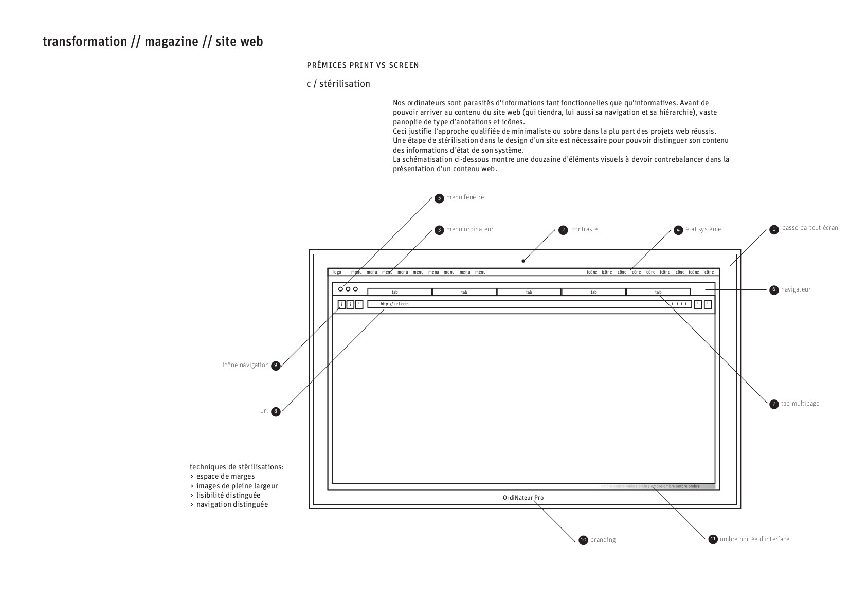
Among the many communication channels available to us as Media and PR specialists, the printed formats allow for detailed, complex and serious information transferal. Project reports, brochures, press releases and publications to list but a few, can all carry non-direct communication via the design of the documents themselves. With this research project, we will research and analyse what makes printed text dynamic, what aids legibility and generally speaking, what makes a document look high or low quality. Our focus will be on communication, primarily, getting the messages of the text across in clear and direct manors. Secondarily, we will learn general rules of document lay out to aid our next project around multi page document design.
Procedure:
In groups of two students, you will select one printed publication and one web publication to analyse.
A printed publication can be anything from a magazine you purchase, a programme for a public institution like a museum or a theater, a project report, a conference programme, a newspaper, a weekend edition newspaper, or even brochures you might get in your postbox. Try to pick a publication that is at least 8 pages long and it is preferable to pick material that you enjoy reading and observing.
The web publication can be any website that publishes regularly. This may be a news website, a blog, something local or international. The requirement here are: regular publication of new articles, ideally new posts/articles at least every week. Social media platforms and profile pages, e-shops, any website that have no long form articles will not be suitable for this project.
Examples of web publications: reallifemag.com, www.theguardian.com, rte.ie, https://www.joe.ie/, etc
Objective:
this project is designed to broaden our aesthetic horizons and understand the indirect languages of communications through document and layout design. This research project will provide the basis for the next projects in semester 2.
Deliverable:
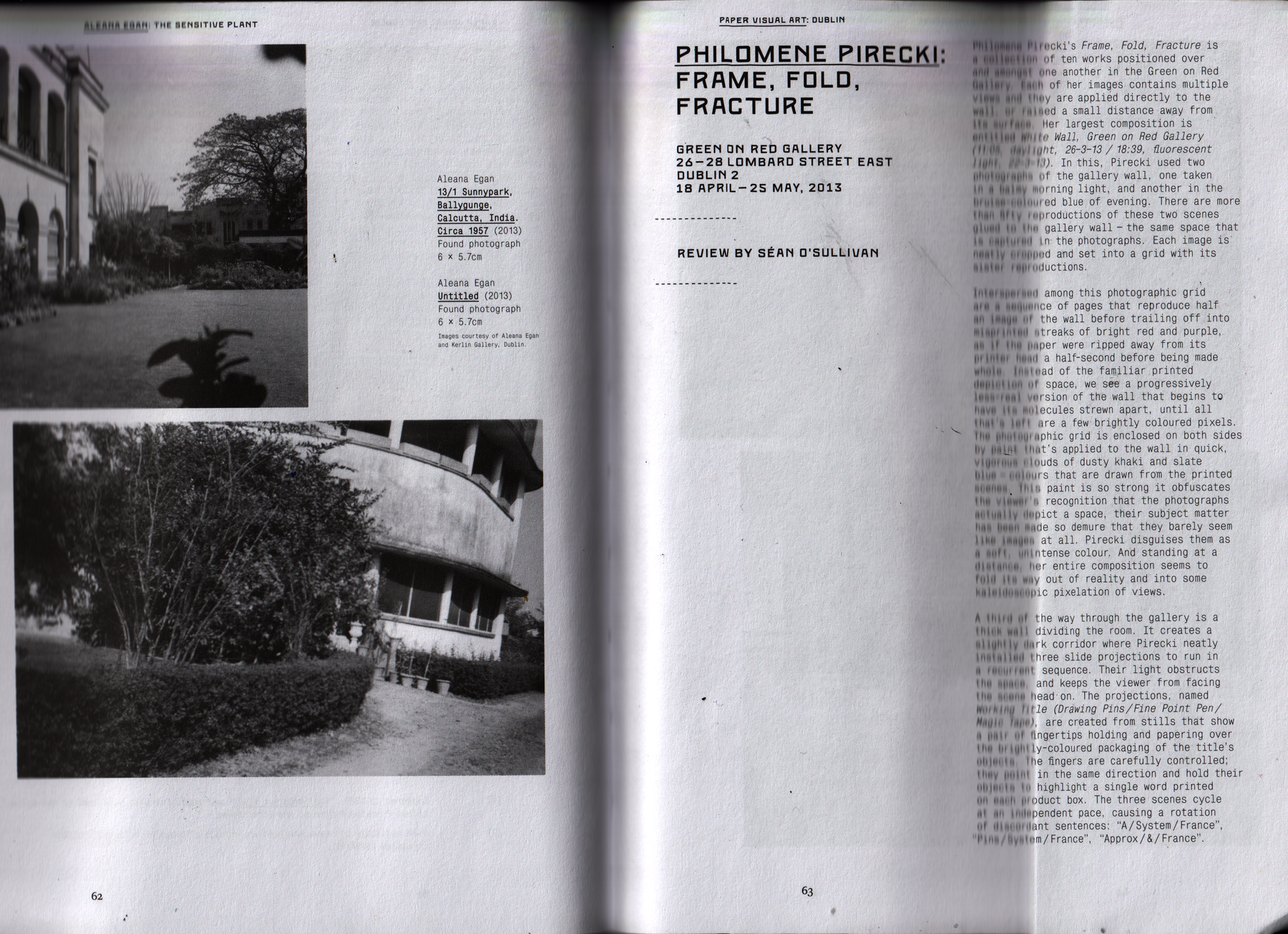
10 minute presentation, 5 minutes on each publication you have analysed. You and your partner will both speak about both publications, meaning you must both get familiar with both publication types and speak about each. Use visuals in your presentation to make sure the entire class can see the pages of the publication; use a scanner and use screenshots for each publication type.
Presentation Date:
Wednesday 22nd January 2020 — 14.00
The presentation might include answers to the following questions:
Printed publication questions:
- What is the title of the publication ?
- What is the publication about ?
- How often does it get published ?
- How much does the publication cost ?
- What is the size of the publication: How many pages does it have ? Is the page format bigger, smaller or equal to A4 size ?
- What does the publication include: Only articles ? If yes, how long are the articles on average (count in amount of pages) ? Does the publication include advertising ? How many ads are there in the publication ?
- Does the publication have a table of content (sometimes called index) ? Are there categories of content shown in the index ?
- Does / How does the publication use images ? Only photographs ? Illustrations ? Graphics ? Infographics ?
- Do the pages of the publication feel busy ? Or is the content quiet with lots of space ?
- What kind of typography is used for the titles ?
- What kind of typography is used for the body of the text ?
- Do the designers of the publication try to create extra rhythm in the publication by using repetitions ? Extracted quotes made big ? Extra titles in the article itself ?
- Is the paper glossy or mat ? Does the paper feel thick or thin ?
- Does the publication have a web counterpart ?
- Does the publication feel organised or is it chaos ? Is it easy to find the articles you want to read ?
- What does the publication communicate to you overall ? Is it a fun publication ? Is it serious ? Is it quirky ? Does the publication derive its design from the subject it speaks about ? (example of this: a soccer magazine will use bright colours, like the players jerseys, lots of green, like the grass on the pitch, and will have lots of sports focused ads)
Web publication questions:
- What is the website called ?
- What is the website about ?
- How often do articles get posted on the site ?
- Since when has the website been online ?
- What are the subjects dealt with by the website ?
- How does the navigation of the site work ? Do you go from the homepage to the article, or do you use categories or filters first ?
- How long is a typical article on this website ? (To measure this, copy and paste the content of one of the articles into a Word document and read the word count from there)
- Does the website use images in the articles ? What kind ? Photographs ? Illustrations ? Graphics ?
- Would you describe the pages as very busy and full ? Is it more quiet and calm, maybe to aid legibility ?
- What kind of fonts are used on the website ? Is it the same font for titles and body text ?
- Do the designers of the website try to create extra rhythm in the publication by using repetitions ? Extracted quotes made big ? Extra titles in the article itself ?
- Does the website use ads ? On every page ?
- Does this website work well on mobile ? (in the industry we ask: is the web design responsive ?)
- What does the website communicate to you overall ? Is it a fun website ? Is it serious ? Is it quirky ? Does the website derive its design from the subject it speaks about ?
example presentation
Fill out groups in the pad below:
2020/01/22
Principles of layout & composition
Some acknowledgements:
Further principals of layout:
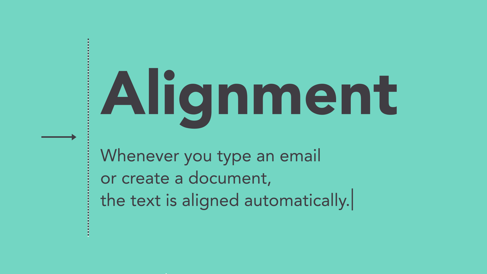
5 basic principals
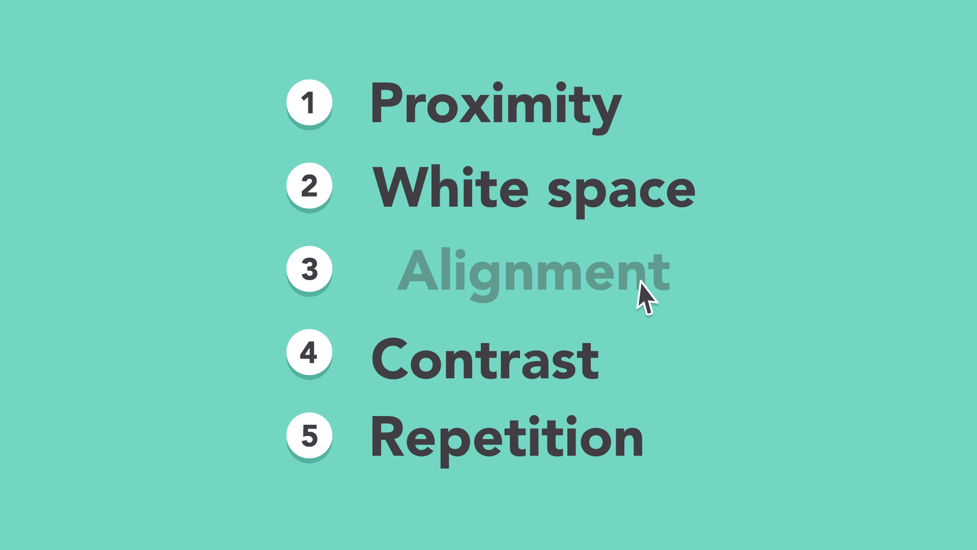
Proximity
White space
Alignment
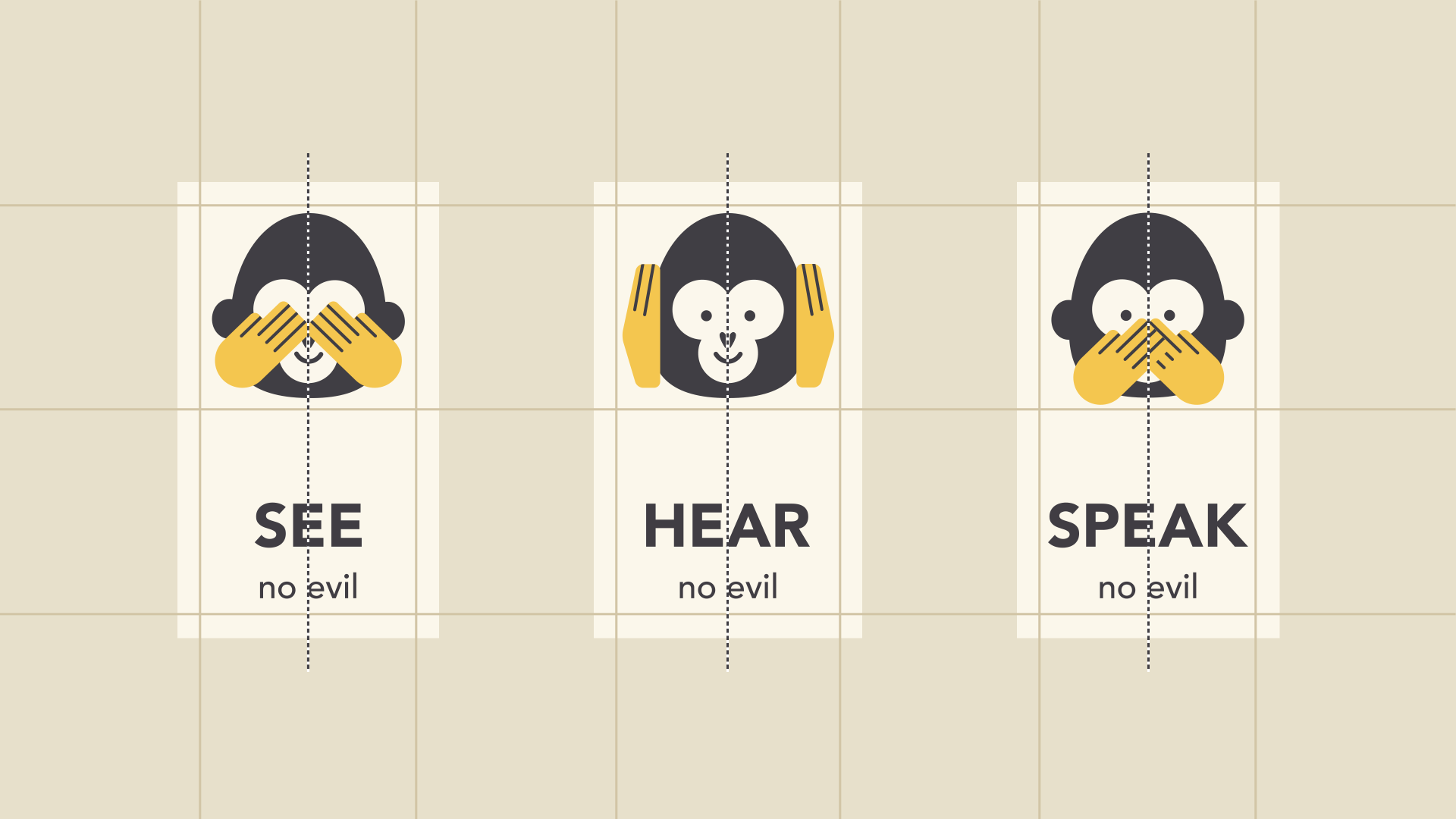
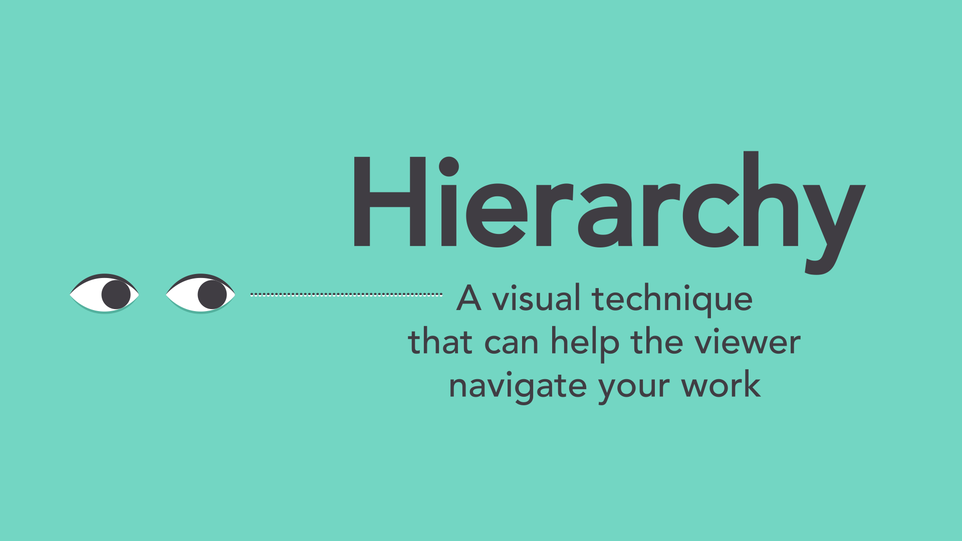
Contrast & Hierarchy
Repetition
Putting it all together
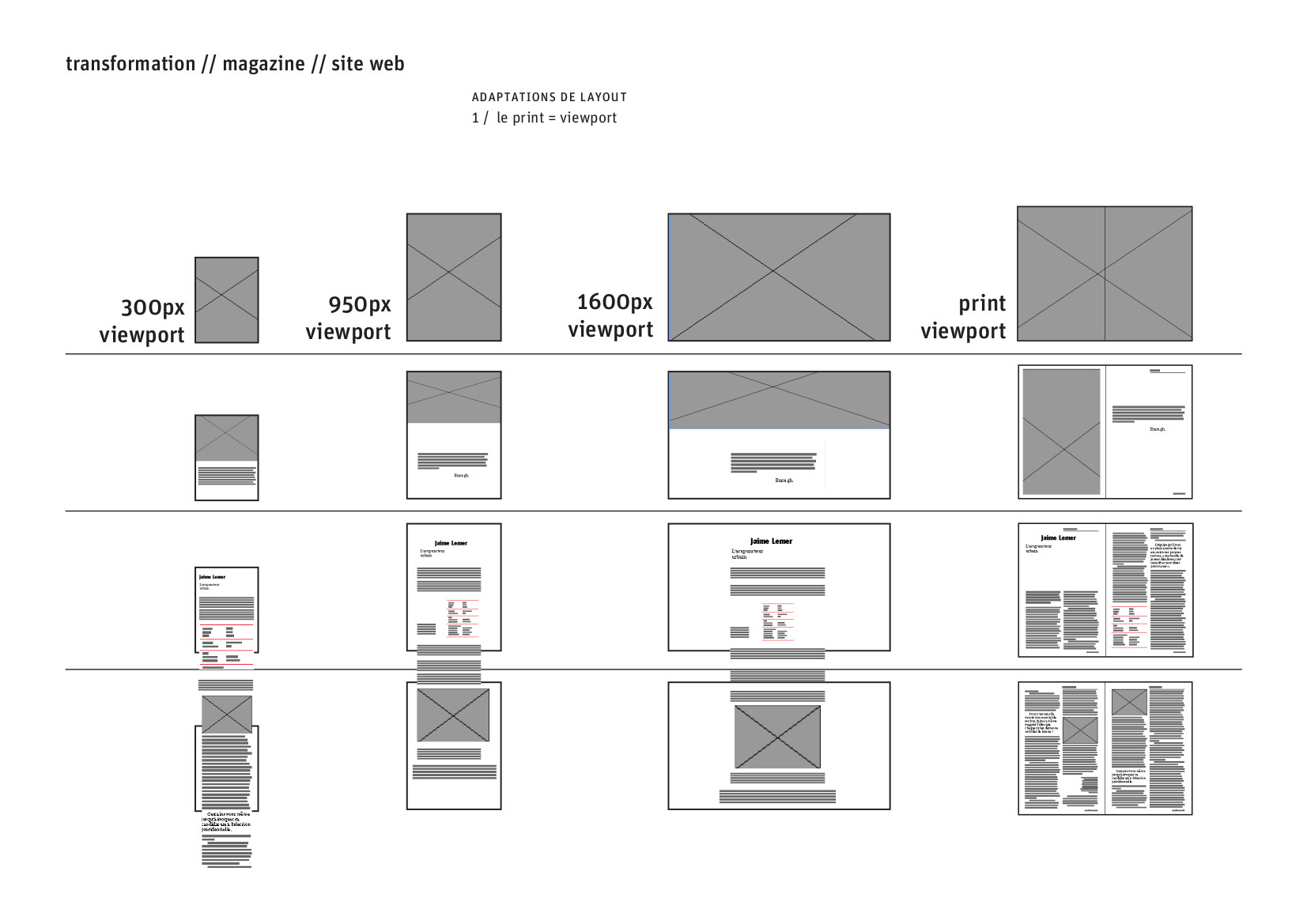
Wireframing and reproduction
from this:
to this:
to this:
2020/02/12
taking layouts apart → building new layouts
Now that we have followed the process of taking apart a finished page lay out, it is our turn to begin building documents with high communication abilities. The layout of a document can greatly increase its value, as it enables the reader to be guided to the most important information, to be given highlights of data elements and most of all, create a quality reading experience.
The document that is linked here is a ISSE Irish Survey of Student Engagement report from the StudentSurvey.ie survey group. The Student Survey started in 2013, which makes this a very important year to return to in terms of the reports that were made back then.
What is being delivered to you is the content of the report, in a raw, unprocessed format. It is a plain word file with some basic indications of the hierarchy of information. Your task is to read this document, understand what it is about, figure out the structure of the document itself, and decide how to design a page lay out that will support and give access to this information in the most legible manor possible.
This exercise will require a lot of studying of existing report documents, other publications, journals and possibly also online magazines to take ideas and inspiration from in order to design the best document possible.
This exercise will continue as a group project, you will continue to work in the same pairs that you carried out the research project and wireframing project with.
For this first session, you are required to get familiar with the document, read through its entirety, and attempt to extract a structure from it. Try to identify how many different types of content there are: questions and answers, statistics, longer paragraphs of detail text, lists, possible infographics, etc.
In the next weeks we will be learning to use inDesign, a software specifically made to aid page / publication lay out of this type.
next section:
→ International Design Movements